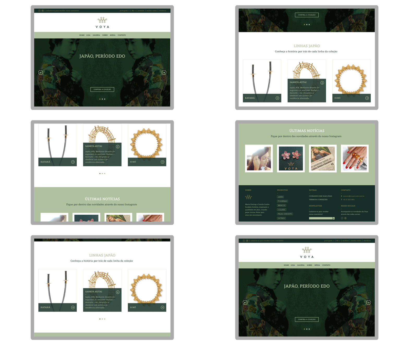
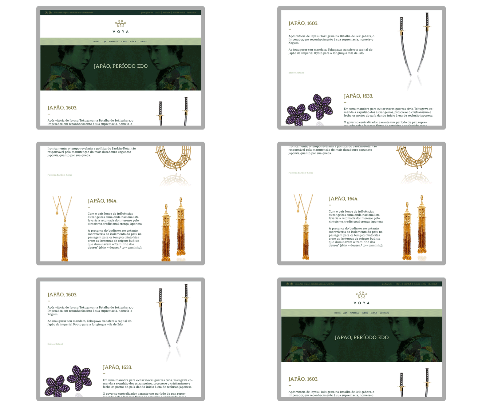
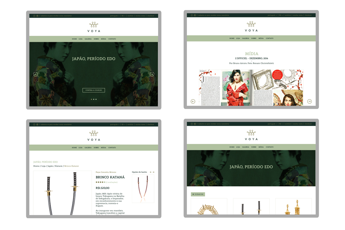
Project was developed while working at Pixelfordinner. We designed the user interface of the jewelry brand's website, introducing the studio's mission, collections and online shop through an intuitive interface.


Project was developed while working at Pixelfordinner. We designed the user interface of the jewelry brand's website, introducing the studio's mission, collections and online shop through an intuitive interface.


